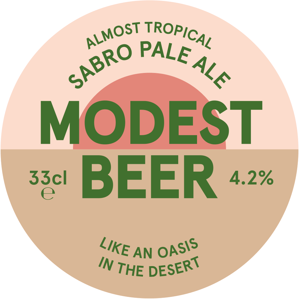
Modest Beer
All the personality, none of the bluster.
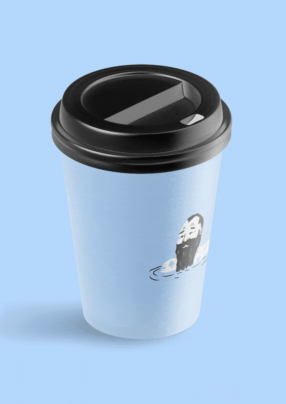
The craft beer market has a split personality. On one side it takes itself far too seriously and the other can be excessively irreverent and gimmicky. There has also been an explosion in recent years of illustration-lead labels making it difficult to position new products and creating a lot of visual noise for customers browsing the offy.
By keeping things simple and putting the tasting notes on the front label, we made the beer the focus while standing out of the crowd on the shelf. Combining this with bold colour palettes and bit of wry humour, we were able to strike a better balance between product and personality in a perfect demonstration of Modesty.
2020 update Modest Beer launched nearly two years before Carlsberg Export’s latest campaign. Just saying – not bragging (that wouldn’t be very Modest).
What we did
Naming
Design system
Labels and Packaging
Copy writing
plenty
Project Management
Planning Consent
Acoustic Solutions


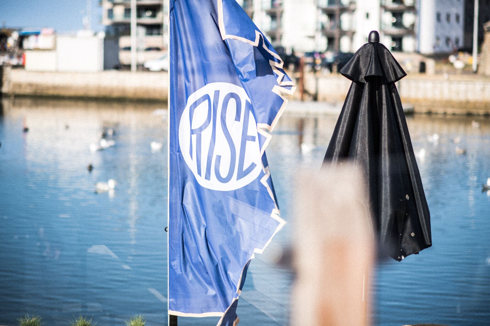
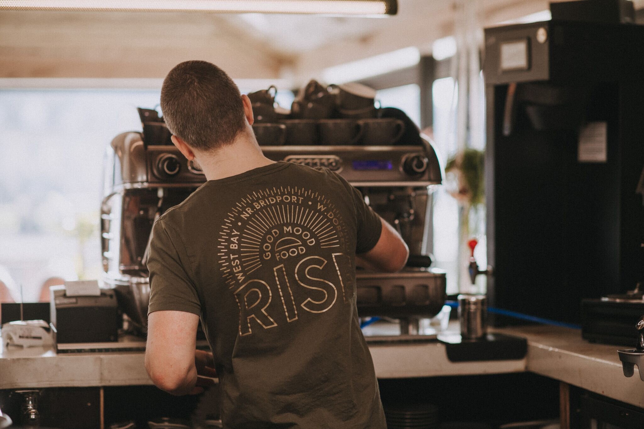
RISE
Summerisle
Sitting on it’s own tiny peninsular in the middle of the River Brit, accessible only by a narrow footbridge, and built piecemeal over the years, Rise is an unusual sight to behold.
We played on the idea of symbolism, using a number of different typographic marks and illustrations to create a lore associated with the island. The overall effect is a sense of intrigue and looseness in the brand marks while retaining a distinct aesthetic that is undeniably Rise.
What we did
Naming
Illustration
Packaging
Menus
Uniform
Singage
Website


Swim
No Shirt, No Shoes, No Problem
The beach, directly outside Swim’s front door is the perfect spot to watch people of all shapes and sizes go about their day completely at ease with themselves, despite the fact they’re barely wearing any clothes. ‘The Brit in summer’ is more than inspiration for this identity – it’s a perfect embodiment of the brand’s tone of ease and comfort.
We created multiple illustrations to reflect the wide cross-section of society outside. These characters are now scattered liberally across all touch-points.
What we did
Naming
Illustration
Packaging
Menus
Uniform
Singage
Website


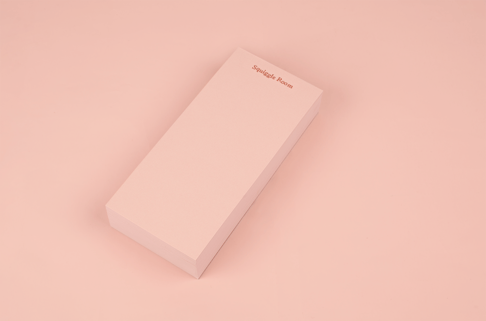
Papersmiths
Always stationery, never stationary.
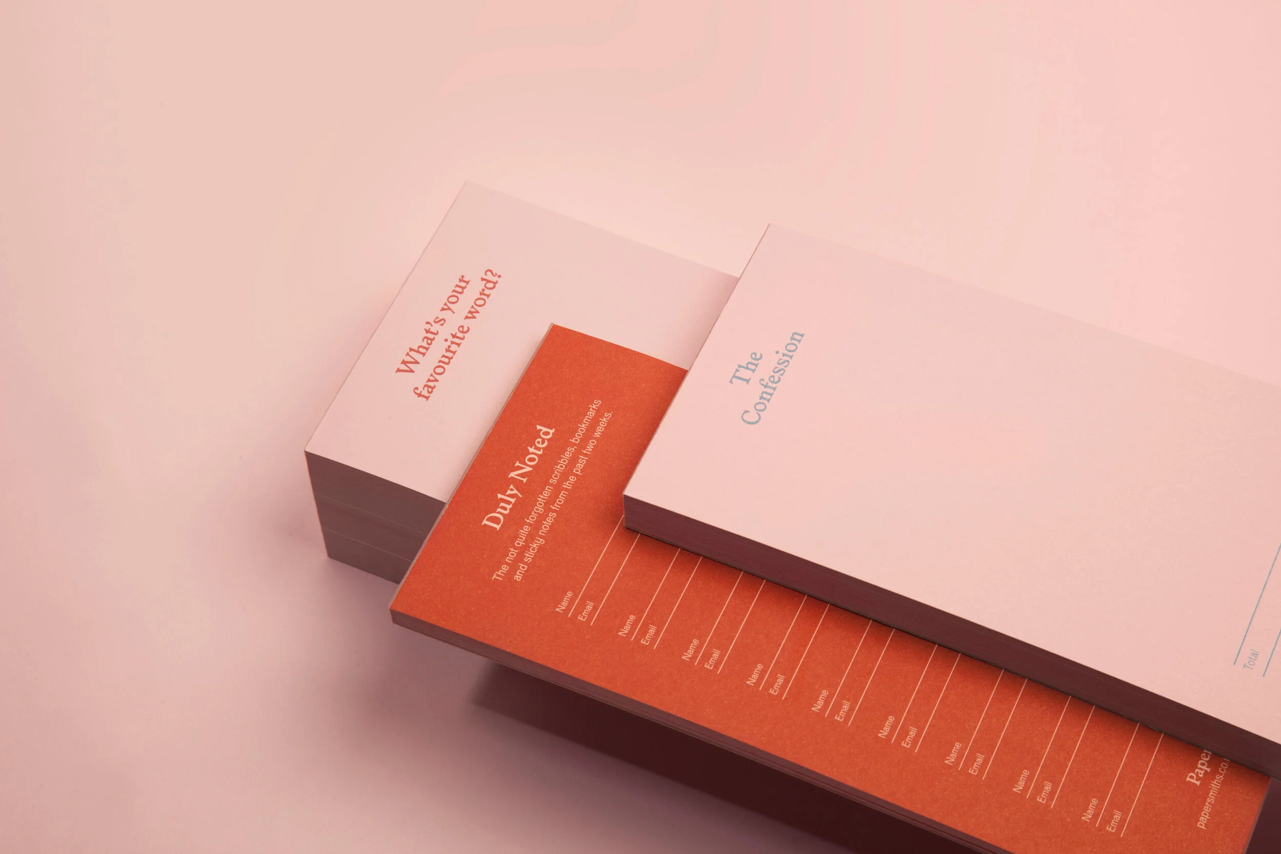
Unusually, we own and operate Papersmiths, so when it came to branding we had some unique insight. For years we had been observing all the ways Papersmiths customers tested pens on our pads. Far outnumbering the signatures, games of noughts and crosses, and crudely drawn penises, was the humble squiggle; from this basic mark, all creative ideas flow.
As a creatives ourselves, we adopted the squiggle to represent the creative potential of the stationery we sell. This simple idea creates an incredibly adaptive identity that is constantly evolving, informing layouts, icons, patterns, illustrative styles and the products we are now manufacturing.
What we did
Naming
Visual Identity
Packaging
Products
Illustration
Singage
eCommerce Website
Sigange & POS
Newsletters
Marketing